

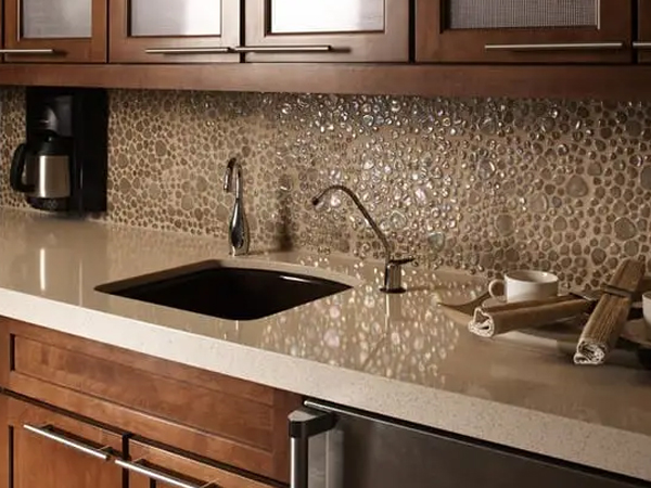
Light cabinets have a way of making a kitchen feel bigger, brighter, and more welcoming the moment you walk in. They reflect light, open up the space, and create that clean, timeless look most homeowners want.
However, once the cabinets are installed, the next decision can feel surprisingly stressful. The kitchen backsplash suddenly carries a lot of weight in the design.
If you go too plain, the kitchen may feel flat and unfinished. If you go too bold, the space can feel busy or overwhelming. If the color is off by even a little, everything looks disconnected.
At Kitchen Concepts, we help homeowners navigate this exact choice every day. As a second-generation, family-owned kitchen design company serving the Greater Binghamton area for decades, we bring our mobile showroom directly to your home so you can see real materials in your real lighting. With more than 30 years of design, woodworking, and construction experience behind us, we focus on helping you make smart, lasting decisions instead of trendy ones you might regret.
Let’s walk through how to choose a kitchen backsplash that truly complements light cabinets.
Why is the backsplash so important when you have light cabinets?
Light cabinets act like a blank canvas. They do not compete for attention, which means your backsplash naturally becomes the visual centerpiece of the kitchen.
Because of this, the backsplash adds personality, contrast, and texture. It ties the countertops and cabinetry together and helps the whole room feel intentional.
When chosen thoughtfully, the backsplash elevates the entire kitchen. When chosen quickly or without a plan, it can make the space feel mismatched or unfinished.
Should your kitchen backsplash blend in or create contrast?
There are two main design directions that work beautifully with light cabinets. The right one depends on the mood you want for your kitchen.
If you prefer a calm and timeless look, choose a backsplash that blends. Soft whites, creams, warm grays, or light neutrals create a seamless transition between surfaces. This approach keeps the space open and airy.
If you want more depth or visual interest, choose contrast. Darker tones, textured finishes, or patterned tile will make the cabinets stand out and give the room more character.
We often ask clients a simple question during consultations. Do you want your kitchen to feel quiet and subtle or bold and expressive? Your answer usually points you in the right direction.
What kitchen backsplash colors work best with light cabinets?
Light cabinetry gives you flexibility, which is one of its biggest advantages. Still, certain colors tend to look better and age more gracefully than others.
Some of the most reliable choices include:
Soft gray
Warm beige or greige
Natural stone tones
Matte white with texture
Navy or deep blue
Muted greens
Charcoal or black accents
These shades add interest without overpowering the room. Extremely bright whites can sometimes feel sterile, while trendy or highly saturated colors may feel dated after a few years.
Seeing these tones inside your own kitchen is important. Lighting changes everything. That is why our mobile showroom helps homeowners compare samples directly in their space instead of guessing under store lights.
Which materials are the most practical for a kitchen backsplash?
A backsplash needs to look great, but it also has to handle everyday life. Kitchens experience steam, splashes, grease, and frequent cleaning, so durability matters just as much as style.
Here are the materials we recommend most often:
Ceramic tile: Ceramic is affordable, easy to clean, and available in endless styles. It works well for most households.
Porcelain tile: Porcelain is denser and more durable than ceramic. It resists moisture and wear, which makes it ideal for busy families.
Natural stone: Stone adds warmth and richness that never goes out of style. It does require sealing and a bit more maintenance, but many homeowners love the authentic look.
Choosing the right material helps your kitchen backsplash stay beautiful for years without constant upkeep.
How do backsplash patterns affect the overall look?
Pattern plays a big role in how your kitchen feels. The same color tile can look completely different depending on the layout.
Classic subway tile offers a timeless, familiar look. Vertical stacking can make ceilings feel taller and the space more modern. Herringbone patterns add movement and texture. Large-format tiles create a clean, minimal appearance with fewer grout lines.
If your cabinets are simple and streamlined, a patterned backsplash can add personality. If your cabinetry already has detail, a simpler tile often provides better balance.
The goal is harmony, not competition.
Does grout color really make a difference?
Grout color has more impact than most people expect. It changes the entire appearance of the tile.
Light grout creates a soft, blended look. Dark grout highlights each tile and adds contrast. For example, white subway tile with gray grout looks modern and graphic, while the same tile with white grout looks traditional and subtle.
We often suggest mid-tone grout for practicality. Pure white grout can show stains more easily, while slightly darker tones hide everyday wear better.
How does lighting influence your choice?
Lighting affects color and texture in ways that are hard to predict. A backsplash tile that looks warm in a showroom may appear cool in your kitchen. Shadows and under-cabinet lighting can also change how finishes look throughout the day.
This is one reason homeowners appreciate our shop-at-home approach. When we bring samples to your home, you see them under your exact lighting conditions. That helps you make decisions with confidence instead of guesswork.
Should the backsplash match the countertop?
It does not need to match perfectly, but it should coordinate.
If your countertop has strong veining or bold movement, a simpler backsplash usually works best. If your countertop is more subtle, you can add more texture or pattern to the backsplash.
Let one surface be the star and the other play a supporting role. Too many busy elements competing for attention can make the kitchen feel cluttered.
Why work with a professional designer for backsplash selection?
Small details matter more than people realize. Tile layout, edge finishes, spacing, outlet placement, and grout lines all affect the final result.
A professional designer helps you avoid common mistakes and ensures everything looks cohesive from start to finish.
At Kitchen Concepts, we are proud to continue a family tradition that started more than 25 years ago. We combine decades of design experience with hands-on installation knowledge so every kitchen functions as beautifully as it looks. Because we are mobile, we bring the design process directly to you and make it convenient and personal.
Ready to choose the right backsplash for your kitchen?
Selecting a kitchen backsplash for light cabinets does not have to feel overwhelming. With the right colors, materials, and layout, you can create a kitchen that feels balanced, stylish, and uniquely yours.
If you would like expert guidance and the convenience of seeing samples in your own home, Kitchen Concepts is here to help.
We're based in Endwell, NY, and we proudly serve Binghamton, Johnson City, Vestal, Endicott, and Endwell, NY. Schedule your free in-home consultation today, and let’s design a backsplash you will love for years to come.